 |
FirstModulAR 0.1.0
|
|
FirstModulAR 0.1.0
|
Custom implementation of a UI button, which is directly integrated to work with Canvas Interactions package's XrInputModule.
Very similar to the built-in Unity UI Button component, but since we implement it ourselves, we can define our own logic for when the button "press" event should occur. By default the Unity default button requires a press and a release. We wanted to have control over those events, allowing for the option for the button to "trigger" just on-press, for example.
This package also contains some convenient features like adding built-in sound effects on button mouseover and press, as well as dynamic animations on mouseover and press that work with each of the Canvas Interaction objects's input modes (touch screen mode and raycast mode).
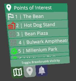
As an example – each entry in the Points of Interest widget above contains a CustomComponents Button component. For that matter, almost every button in all of our widgets should be using this specific Button component.
 1.12.0